User management

Web app
May 2023

SpatialChat  is a Web platform that enables users to engage in audio and video interactions e.g. work meetings, online events, lectures, brainstorming sessions, workshops, and parties.

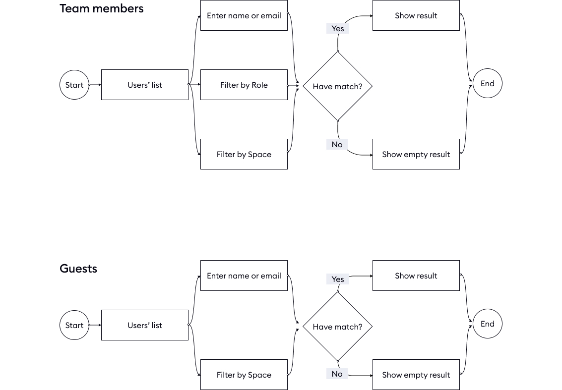
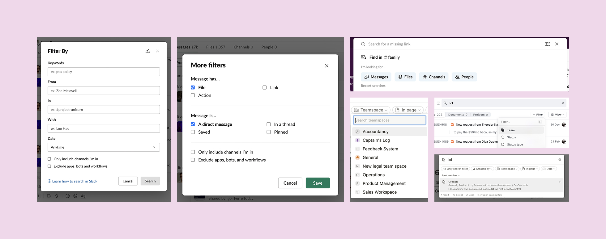
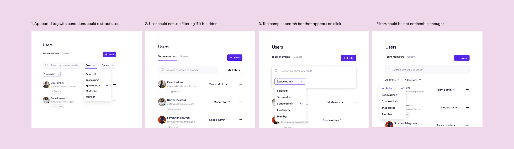
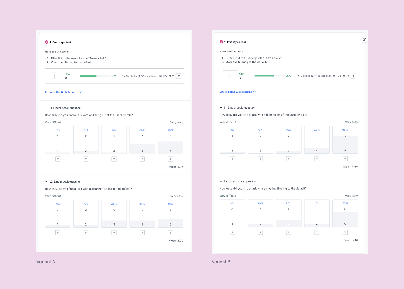
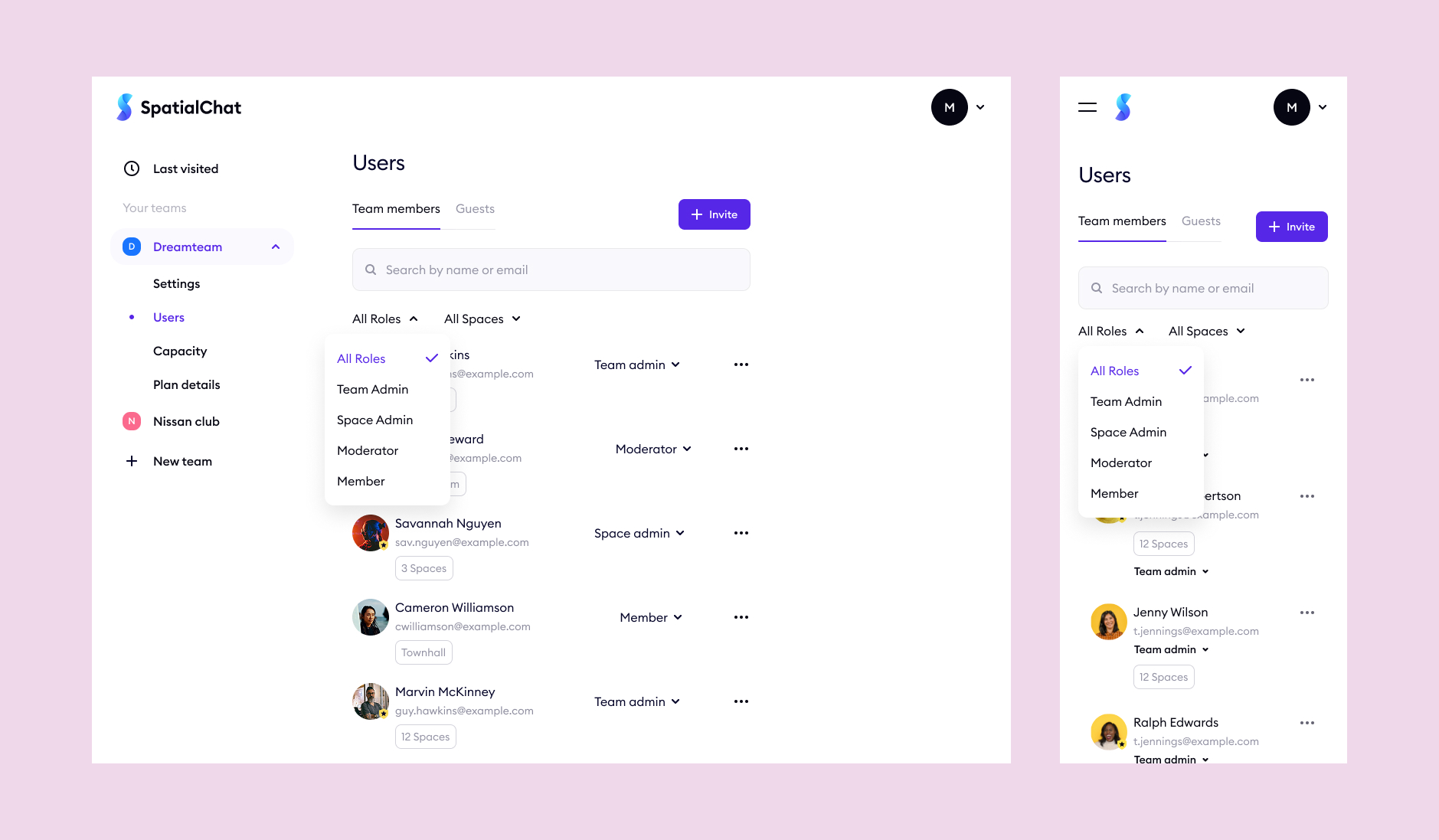
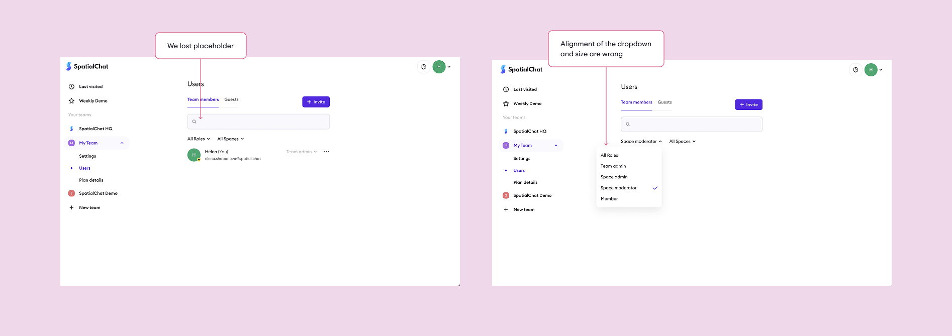
The dashboard displays a list of members and guests of a user's team. The company's main objective is to make the dashboard more useful to users, to reduce the number of support requests, improve its functionality and increase users’ satisfaction.

Role
Product designer
Team
Collaborated with a PM, 1 full-stack engineers, and a QA engineer
Target audience
Admins or moderators with teams of 50+ members who encounter difficulties in finding members by name, email, or role.
Their problems
Hard to find person by name/email/role when you have more than 50 people on a team. The problem is even more significant for teams with over 1000 members.
Business goal
Admins or moderators with teams of 50+ members who encounter difficulties in finding members by name, email, or role.
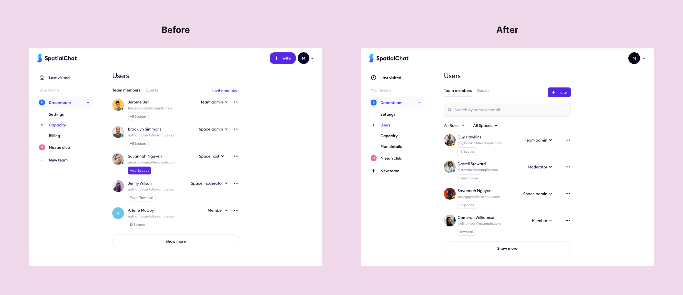
Since the launch of SpatialChat, over 70% of our key users have reported difficulties in finding team members, and over 20% of these teams have specifically requested improvements to the search and filtering features.
Process
To design an effective solution, I used the Design Thinking framework as a base and added additional steps for gathering information, collaborating with stakeholders, and reviewing the final implementation.
Validation
Collaborated with various teams, including the Product manager, Customer support department, Analysts, and Customer success manager.
Survey prep
Gathered support complaints and top feature requests, then created a survey to pinpoint key improvement areas.
Result
Sent the survey to team owners with 50+ members and received a 13% response rate. It was low, yet still gave enough insight to guide the needed improvements.
Tech constraints
The system couldn’t reload all users at once and required extra time. It also handled server requests only iteratively, which slowed role changes. Search and filtering worked for Team Members or Guests, but not both at the same time.
References
To ensure a smooth user experience, I researched other products and took note of what should be considered during the visual design process.
Design exploration
Based on the research, I designed a few variants to improve the user experience and achieve business goals. Since the design system was already detailed but flexible, I skipped the wireframing phase to save time by reusing existing elements and styles.
Feasible variants
Our team evaluated the design variants and chose two that would be the most feasible.
A/B test
To determine which of the two designs was more clear and intuitive for users, I conducted an A/B test using the UsabilityHub platform and built clickable prototypes of each variant to make it happen.
Final design
Here is the final design that was selected based on the A/B testing results and could help us achieve our business goals and address user pain points.
Handoff to developers
To ensure that developers had all the necessary information, I provided comments, other states of the elements, and illustrations, as well as a text for cases when the search and filtering results would be empty.
Design review
During the design review, I had to find differences between my mockups and the implemented design by developers, but this step was unexpectedly skipped, which caused some difficulties.
Result
A month after the release date, our team checked the key metrics and found that even though the filtering and search feature was not perfect, it was successful.
Next step
After release, user feedback showed that some needed to filter by multiple roles, not just one. Since this feedback was limited, we chose to wait and see whether the demand would grow rather than build a feature that might not matter to a key user segment.